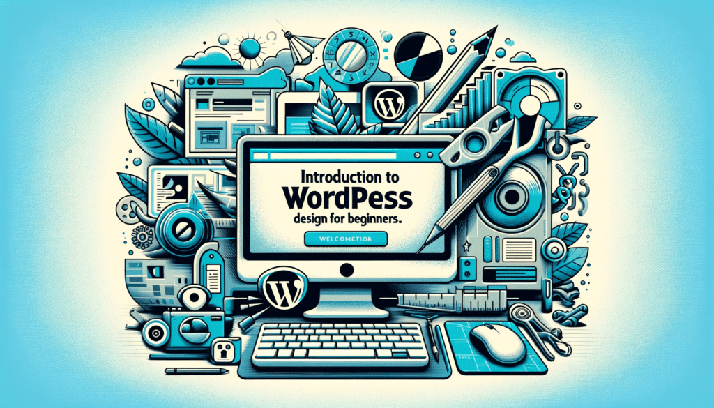
Responsive WordPress Design: Great UX on all Devices
I. Understand WordPress Website Design and the Importance of Mobile-Friendliness

Responsive design is more than a technique; it’s a necessity in the modern web landscape. WordPress, with its flexible architecture, makes implementing responsive design straightforward. See how responsive layouts adapt across devices, ensuring optimal user experience. This adaptability is crucial for engaging visitors and enhancing usability. Remember, a responsive site is key to online success in today’s mobile-centric world.
Importance of Mobile-Friendly Websites
Today, mobile traffic dominates the web. Our bar graph illustrates this significant shift, highlighting why mobile-friendly websites are essential. With WordPress, creating a mobile-friendly site is within everyone’s reach. Additionally, mobile responsiveness greatly improves SEO rankings. Consequently, a mobile-friendly website isn’t just a nice-to-have; it’s a must for reaching and engaging the modern audience.

Understanding WordPress Website Design
WordPress is renowned for its user-friendly design capabilities. It offers a vast array of tools and features for creating responsive websites, which our list will detail. Understanding these features is crucial for anyone looking to build a successful, mobile-friendly WordPress site. This knowledge lays the foundation for effective web design and ensures your site caters to all users, regardless of their device.
II. Setting Up for Success
Choosing the Right Theme for Responsive Design
The journey to a responsive WordPress site begins with selecting the right theme. Our list of top themes showcases options that prioritize mobile-friendliness. These themes ensure that your site will not only look great but also function smoothly across various devices. A well-chosen theme lays the groundwork for a responsive, engaging online presence.

WordPress Website Design: Plugins and Tools
Plugins and tools are the lifeblood of any WordPress site. They extend functionality and enhance responsiveness. Our table highlights essential plugins that are particularly useful for creating responsive designs. Incorporating these tools will ensure your site is optimized for performance and user experience on all devices.
Testing Your Site’s Current Mobile Responsiveness
Assessing your site’s current mobile responsiveness is a critical first step. Our image showcases tools like Google’s Mobile-Friendly Test, which provide valuable insights. Understanding where your site stands allows you to make informed decisions on improvements. A responsive site is crucial for user engagement and SEO success.
III. Implementing Responsive Design
Responsive Design: Key Principles and Practices

Responsive design hinges on adaptability and user-centric principles. Our list of best practices will guide you through creating layouts that fluidly adjust to any screen size. Implementing these principles is essential for a responsive, user-friendly website. A well-implemented responsive design enhances user experience and contributes to higher search engine rankings.
Customizing Themes for Optimal Mobile Experience
Tailoring your WordPress theme for mobile users is crucial. Our image demonstrates the dramatic transformation a theme undergoes after customization. Focus on optimizing layout, navigation, and image sizing for mobile devices. These adjustments ensure a seamless experience across all platforms.
Optimizing Images and Media for Faster Loading
Optimizing images and media is a key aspect of responsive design. Our table presents various techniques for effective optimization. Reducing file sizes without compromising quality is crucial for quick loading times. Fast-loading media enhance user experience and contribute positively to your site’s SEO.
IV. Enhancing User Experience
Navigation and Menus in Responsive WordPress Website Design
Navigation plays a pivotal role in user experience. Our image illustrates adaptive menus, showing how they transform from desktop to mobile layouts. Well-structured navigation ensures users can easily find what they need, regardless of the device used. User-friendly navigation is a cornerstone of effective responsive design.
Ensuring Readability and Accessibility on All Devices

Readability and accessibility are vital in responsive WordPress design. Our list provides practical tips for achieving these goals. Utilizing legible fonts, sufficient contrast, and accessible layouts ensures that your content reaches a wider audience. A focus on readability and accessibility enhances the overall user experience.
Interactive Elements: Buttons and Calls-to-Action
Interactive elements like buttons and CTAs are crucial in responsive design. Our table demonstrates how to adjust these elements for different screen sizes. They should be easily clickable and visible, enhancing user engagement and conversion rates. Thoughtfully designed interactive elements are key to a successful website.
V. Advanced Techniques
Leveraging CSS and HTML for Custom Responsive Design
Delving into CSS and HTML can elevate your responsive design. Our infographic illustrates the power of CSS media queries. These tools allow for precise adjustments, ensuring your site looks and functions perfectly on all screen sizes. Mastering CSS and HTML is invaluable for customizing your WordPress site.
Responsive Design and WordPress Page Builders
Page builders simplify the process of customizing WordPress sites. Our list compares various builders, highlighting their unique features. These tools offer intuitive drag-and-drop interfaces, making design more accessible. The right page builder can be a game-changer in your responsive design journey.
Testing and Optimizing for Various Screen Sizes

Regular testing and optimization are crucial for responsive design. Our table provides tips for optimizing your site across different devices. Ensuring your design performs well on various screen sizes is key to a successful, user-friendly website. Continuous testing and refinement are essential for maintaining optimal responsiveness.
VI. Keeping Up with Trends
Emerging Trends in Responsive WordPress Website Design
Staying ahead of trends is vital in the ever-evolving world of responsive design. Our list outlines upcoming trends and innovations in WordPress design. Being proactive and adapting to these trends ensures your website remains relevant and effective. Embracing new techniques and ideas is crucial for digital success.
Adapting to New Devices and Screen Types
Responsive design must evolve with new devices and screen types. Our collage shows the versatility of WordPress websites across a range of devices. This adaptability is key to providing a consistent and engaging user experience. Staying flexible and forward-thinking in design approaches is essential.
Staying Updated: Tools and Resources for Continuous Learning
In the dynamic field of web design, continuous learning is imperative. Our table lists resources that keep you informed about the latest in responsive design. Utilizing these tools ensures your skills and knowledge remain up-to-date. Staying informed is crucial for maintaining a cutting-edge WordPress site.
FAQ
- What Does ‘Responsive Design’ Mean in WordPress?
- Responsive design refers to a website’s ability to automatically adjust and adapt its layout to fit different screen sizes and devices. In WordPress, this is achieved through themes and plugins that make your site look and function well on desktops, tablets, and smartphones, enhancing the overall user experience.
- Why Is a Mobile-Friendly Website Important?
- A mobile-friendly website is crucial because a significant portion of internet users access the web through mobile devices. Mobile-friendly websites offer a better user experience, which can lead to increased engagement and lower bounce rates. Additionally, search engines like Google prioritize mobile-friendly sites in their rankings, making it essential for SEO.
- Can Existing WordPress Websites Be Made Responsive?
- Yes, existing WordPress websites can be updated to become responsive. This typically involves selecting a responsive theme, implementing mobile-friendly plugins, and making adjustments to layouts and media elements. It might also require some custom coding, especially for unique features or complex designs.
- What Are Some Key Elements of Responsive WordPress Design?
- Key elements of responsive WordPress design include fluid grid layouts, flexible images and media, touch-friendly navigation menus, and readable text without needing to zoom. It also involves using CSS media queries to apply different styles for different screen sizes, ensuring that your website looks good on any device.
- How Do I Test My WordPress Site for Mobile Responsiveness?
- You can test your WordPress site’s mobile responsiveness using various online tools like Google’s Mobile-Friendly Test or BrowserStack. These tools will show you how your site looks on different devices and provide feedback on any mobile usability issues, allowing you to make necessary adjustments for optimal performance.